Back
Financial Aid Dashboard

Show Me The Money

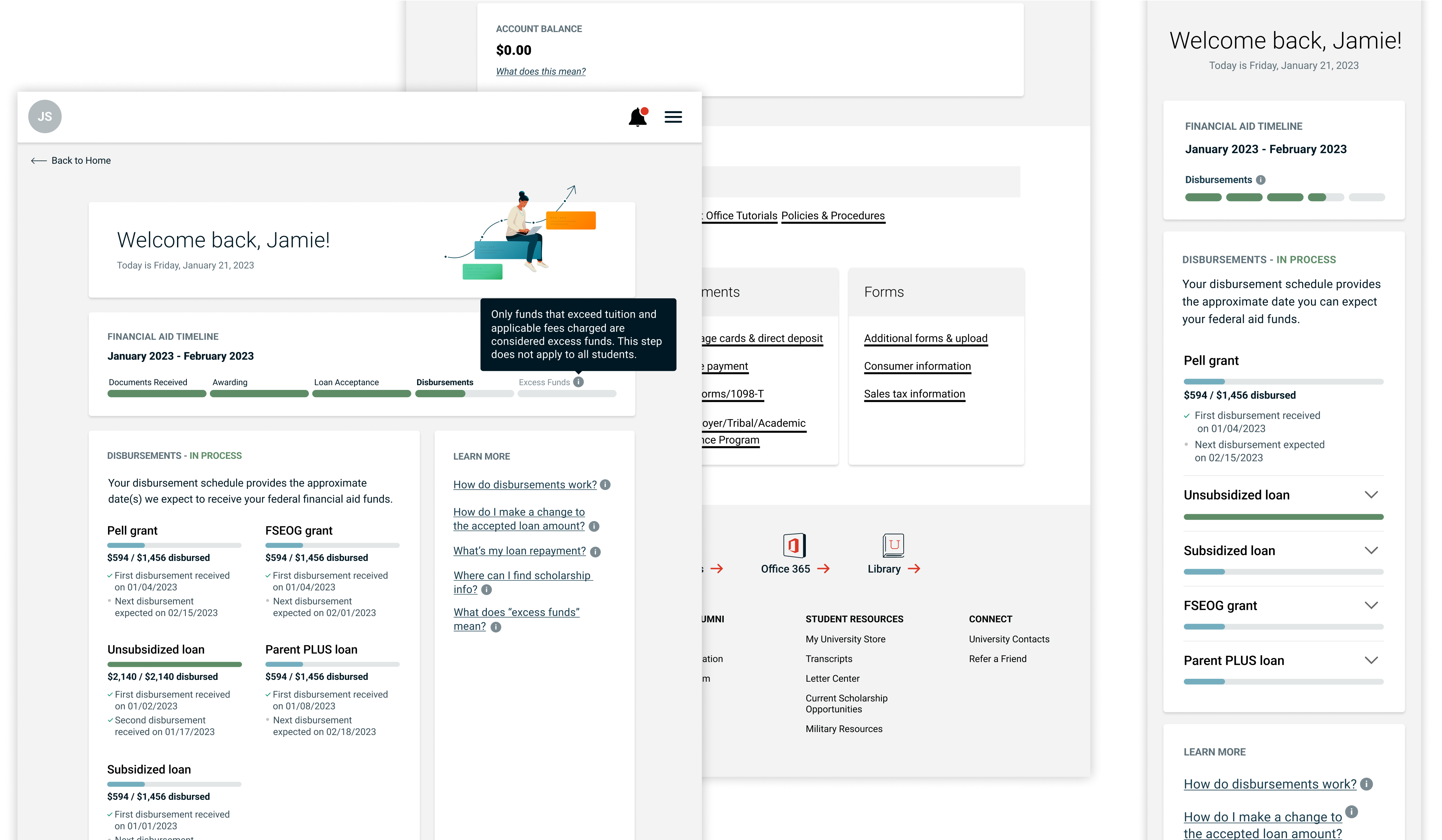
Students were reporting confusion when using the university’s financial aid experience. As part of a cross-functional team, I spearheaded the effort to design a new experience that led to greater clarity for students and a decreased reliance on university support staff.

With schedules and curricula tailored for working adults, this top online university provides degrees and courses for more than 300 professions.

skills
  • Information Architecture
  • Wireframing
  • Prototyping
  • UX Research
  • UI / UX Design
  • UX Writing
  • Agile Framework
  • Design Thinking
  • Figma
Some identifying information has been omitted from these case studies in order to comply with contractual agreements.
The Problem

A vast majority of this university’s students apply for and receive financial aid, but many were struggling to understand the system using the existing dashboard.

A simple lack of context and explanation was the biggest issue, together with an excess of irrelevant information, leading students to call or email support for assistance. The university didn’t want confusion or discouragement to have any part in their students’ financial aid experience, nor did they want to tie up their support teams with conversations that could be prevented through better UX.

The original dashboard included content that didn't necessarily need to live there or could benefit from being presented in a different way. While financial transparency is always a plus, the right sidebar was paralyzing for many students.
my role

Taking what we learned in testing, I redesigned the experience to better navigate the student through the process while surfacing items that needed their immediate attention.

As always, the first step was understanding the scope of the problem. Through conversations with the Director of Financial Services and the Finance Manager, along with a detailed audit of the current experience, I clarified for myself – and others on my team – a full list of pain points. We hypothesized that eliminating as many of these frictions as possible would lead to the self-service experience we wanted to deliver. To measure our success, we planned to test our new dashboard design with real students and track the number of calls to support regarding financial aid.

We tested wireframes and concepts with a diverse pool of students. What we learned underscored what we already knew – that financial aid is a sensitive, scary, and stressful aspect of any student’s life and that anything less than full clarity and accessibility was not going to cut it.
I rapidly iterated on different ways to display students’ financial status. Testing told us that a narrative information structure was easier to understand and more reassuring than a table, especially if it could call out the most relevant action items at any given time.
Based on our data, 50% of students accessed their financial aid dashboard via mobile device. In our user interviews, we learned that the current dashboard was not responsive and was a huge friction point for current students. We made sure to keep mobile top-of-mind during design explorations and testing.

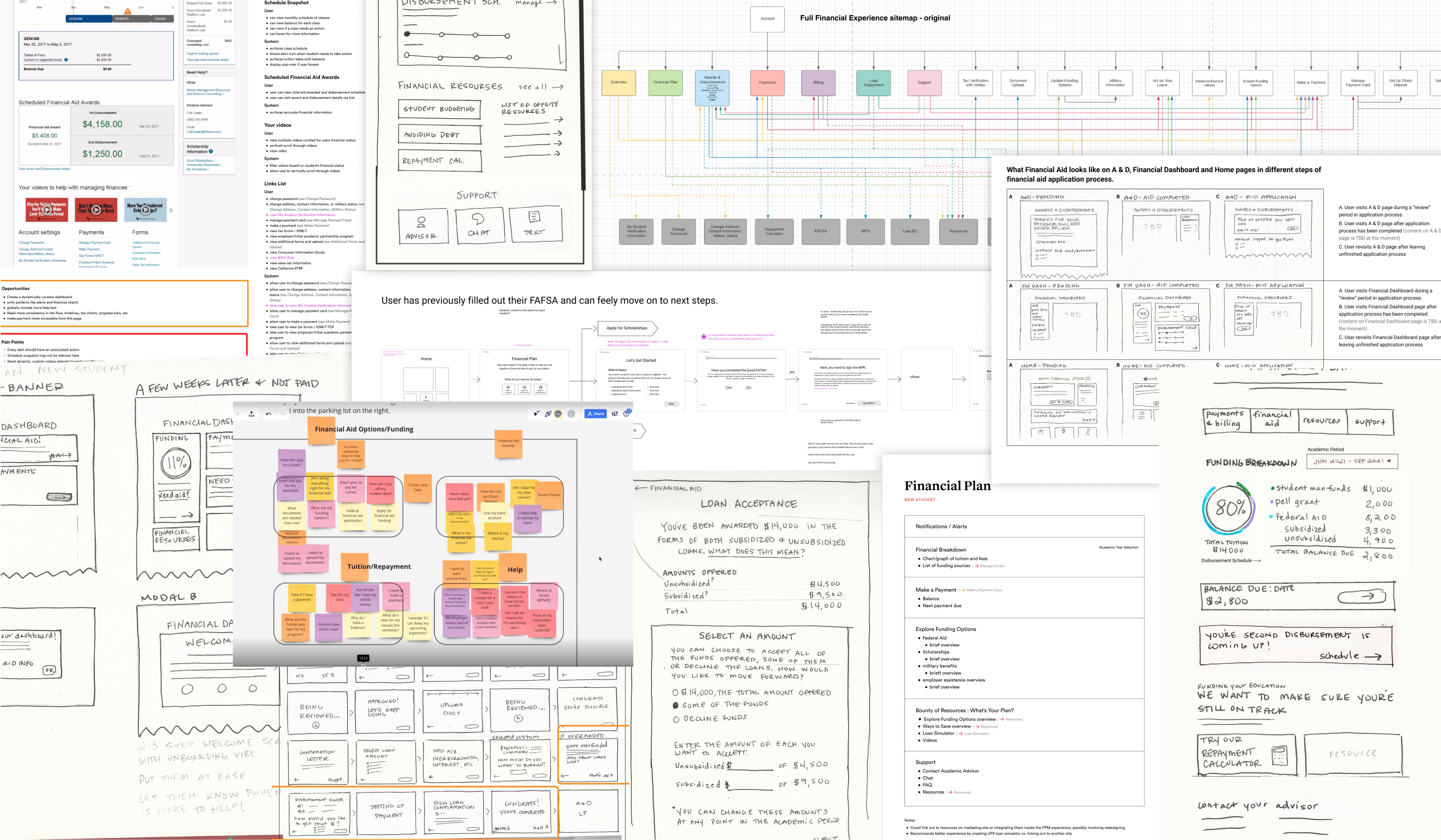
With that in mind, my proposed solution was a dashboard that was more dynamic and contextual to each student. Critical information was to be surfaced with more visual weight, and irrelevant or untimely information would be presented lower. Unnecessary information was removed entirely, but we did incorporate help text, knowledge base articles, and helpful information via tooltips to instill more confidence in the user.

The students told us exactly what kind of information they needed and, more importantly, didn’t need; all we had to do was listen.
the results

Users with whom we tested the new ideas reported that they had a much better understanding of the financial aid process and what was expected of them.

While it’s still in development, the team and I are confident that we’ll hit our OKR with a measurable reduction in calls to support staff.
Swap It Like It's Hot
ARPU Product Swapping Feature
Serving Up Fresh Insights
Zignyl Reporting